How to Use Google Grants and AdWords for Non-Profits: Important Changes You Should Be Aware of in 2018

Did you know that Google offers ad grants for non-profit an charity organizations in Canada, allowing them to run their AdWords with a budget of $10,000 per month? If you run a charity or non-profit, this is something you have to take advantage of – it’s free advertising and drives targeted traffic to your site (if you set it up right!).  

  • First, you need a Tech Soup account  and registration – which verifies your non-profit status and eligibility
  • Once that is approved, you can then set up your new Google account and apply to manage your grants ads.

Google Ad Grant Changes for Non-Profits

Over the years, 35,000 non-profits have set up Ad Grant AdWords accounts, and it has been a popular offering, but recently though, Google has been rolling out a slew of changes that govern how ads are set up in the Grants program.

Above angle of hands typing on laptop on white desk beside a notebook, iPhone and mug of coffee
How to Use Google Grants and AdWords for Non-Profits

I am guessing these changes are because many organizations were lax about maintaining their ads –  setting up accounts, campaigns and groups and then not maintaining their accounts well or keeping up with the new features Google has rolled out over the last couple of years like ad extensions. It could also be because some non-profits didn’t set up their accounts properly in the first place (for example not using geographical audience targeting).

As a result of these changes which were announced in December and went into effect earlier this month, non-profits are scrambling to review their ad campaigns and make them compliant – if they don’t, they risk having their ad account cancelled.

The good news is that there will no longer be the USD 2 ad bid cap which means that non-profits can bid more competitively and show up higher than ever before. There are some caveats though.

The New Google Grants AdWords Rules for 2018:

  • The two dollar bid cap has been removed
  • Advertisers must use maximum conversions bidding – this automatically sets your bidding so that you maximize the conversions of your campaign given your budget (for non-profits that about $333 per day). This means setting up conversions on Google and tracking them using two snippets of code that get added to your site and to the page you want to track.
  • Advertisers must use geographical targeting aka geo-targeting – this simply means that your ads must be targeted to your geographic area and not blanket targeted to broad geographical areas where you don’t operate.
  • Each campaign must have at least 2 Ad Groups that are live.
  • Each ad group must have at least 2 ad variations running.
  • Each ad must have a minimum of 2 site link extensions – site link extensions are links and titles that show up below your ads highlighting important aspects of your business and encouraging people to click through to specific web pages on your site.
  • Your account must show a CTR of at least 5% or your account could be cancelled. This is the rule is the one that everyone is panicking about, but if your campaigns are set up properly with keywords that are tight (specific to what your non-profit does), and you’re not bidding on words that don’t relate to your ad text, you should see your CTR increase.

Ten Tips to Help Non-Profits Comply with the Google Ad Grant Changes:

  1. Have specific campaigns for each component of your non-profit business using specific keywords, both in the keywords themselves and in your ad text and landing pages.
  2. Stop using keywords that are too generic – low-quality keywords.
  3. Conversely, don’t have ad groups that only have one keyword.
  4. Work to create better, target keyword centric ad copy.
  5. Make sure that your landing pages map back to your ad campaigns and groups and that everything works as it should on the page so that visitors convert once the land on your site.
  6. Set up conversion tracking and make sure that you are tracking conversions after people click through to your site.
  7. Use Google Analytics to understand campaign traffic, keywords that are driving visits from people who engage once they land on your site, and bid adjustments.
  8. Don’t use keywords that mention your competitors or other companies.
  9. Implement your changes now, if your CTR is less than 5% for two consecutive months your account could be suspended.
  10. If you don’t have the expertise in-house to make these changes, or the budget to hire experts then consider switching to AdWords Express.

Google Grants can be a great asset to a cash-strapped charity or non-profit organization. Done right, your campaigns can drive targeted traffic to your site, but your site has to deliver too. It is worth taking time to create great landing pages that convert once your visitor lands on them.

If you’re one of the non-profits that have neglected their campaigns over the years, this is the perfect time to restructure them and to take advantage of some of the great enhancements Google has been rolling out recently.

If you are concerned about your non-profit ads and don’t know where to start, we’d love to review them for you and make some recommendations. Get in touch with us here.

Marketing Predictions and Digital Trends for 2018

Ten years into the great social media experiment and 2017 was the year we saw Facebook hit the 2 billion user mark, the proliferation of real-time video across social platforms and the continuing email renaissance. With 2018 coming up fast upon us what better time to reflect on the past year, to dust off the crystal ball and to predict what 2018 will bring for marketers.

This post is divided into five sections to mirror the disciplines Out-Smarts focuses on websites trends, SEO – getting found when people search online, email marketing, social media and overall marketing strategy.

Website Design Trends

We know that Google is going to continue to emphasize the importance of mobile in 2018 so expect to see function taking precedence over form with a focus on usability and minimalist site navigation and content proliferating. It’s going to be interesting to see how the content is king crusaders balance their obsession with publishing content with minimalism and mobile. Expect to see more valuable content related to buyer intent rather than simply content for the sake of putting something out there.

Will 2018 be the year when small businesses finally catch up? 50% of small businesses still don’t have a website; we’re hoping this new year will be the one the laggards finally catch up. It is interesting that social media adoption for small business is much higher than website adoption. The popularity of social media is likely because of a low barrier to entry of social platforms. However, it is important to consider that you don’t own your Facebook, LinkedIn or Twitter pages (or any other social media presence you might have) the social media company owns it. What happens if they switch directions or go out of business? A website belongs to your business, not to a third party.

Watch out for more animation (logos in particular) and websites that incorporate GIFs in 2018 too – hopefully, they’re less cheesy than their Flash predecessors. Artificial Intelligence is going to be everywhere in 2018 too as enhancements make Chatbots get better and better at answering questions and simulating conversations with website visitors.

Search Engine Optimisation

Don’t let anyone tell you that keyword research is no longer important. It is and will continue to be, but there will be a shift in 2018 to focus more on semantic search, buyer intent and topics rather than specific keywords. SEOs will focus more on having their site show up at the right time when people are actually considering a purchase, rather than having the site show up to attract particular personas.

Another aspect that should be on your SEO radar in 2018 is voice search which means you need to hone your long tail keywords, i.e. keyword phrases that are hyper-specific to what you are selling.

Image search will continue to grow in 2018 so now might be the time to make sure all the images on your website have well thought out and optimized alt tags.

Email Campaigns

The email renaissance will continue in 2018. Get ready to watch videos embedded directly in email campaigns. Technological enhancements in email clients will continue to lead to more and more email apps that support embedded video. Right now less than half of all email clients can play embedded videos but thanks to Apple mail, iOS and Samsung this is changing. Up until now, most senders have opted to embed a fake play button in the email with a link to the video on a separate site or by GIF.

Including video in emails can lead to big increases in open rates – Campaign Monitor

Watch for more sophistication in list segmentation too. Segmenting campaigns so that specific audiences receive emails that contain content tailored to their unique perspective.

Social Media

2017 was the year of streaming video in social media; LinkedIn In and Twitter followed Facebook Live’s lead and began supporting live streaming video content. In 2018 watch out for growing adoption of these technologies and more creative live streams.

Over 8 billion videos or 100 million hours of videos are watched on Facebook every day (TechCrunch, 2016). – via Buffer

Not doing short video is not an option – Kat Hahn

In 2018 we will also see the increased adoption of short-lived content, content that’s only available for a short period of time before it disappears, – like Instagram stories and Snapchat. Marketers must start developing strategies to maximize the reach and impact of ephemeral content as well as considering tactics to get this content noticed.

On platforms like Instagram and Facebook, only a tiny percentage of followers actually see the content you share on your page. To get noticed in 2018, you will need to invest in ads on these platforms. Consider video ads to spice things up a little.

Social media analytics, measuring tools and management solutions will become more sophisticated in 2018 with an emphasis on enterprise social marketing integrating all platforms.

How Marketing Strategies will Evolve in 2018

Above angle of two people on laptop and tablet, beside craft supplies

I am going to go out on a limb here and predict that 2018 will be the year that our obsession with all things digital and only digital will end. It’s also going to be the year we’re going to start calling our discipline marketing again (rather than digital). Marketing in 2018 will encompass all aspects of the marketing mix, both online and off and marketers will use the means most likely to help them attract their target audience.

Consider this, there are 65 million business pages on Facebook, 90% of businesses use social media. These are substantial numbers, but for marketers this means that it is becoming increasingly difficult, not to mention more expensive, to get noticed. If you want to attract your target audience’s attention in 2018, then widen your horizons and consider sending them a direct mail piece (depending on the audience) in a nice coloured envelope with handwritten wording. It will likely be the only physical mail the recipient gets that day (or maybe that week or month!), they’re going to open it, and if your copy is effective they will act on it!

Conclusion

2018 is going to be an interesting year; technological advancements will continue to speed up. To be effective as marketers, it’s going to be important not simply to jump on the bandwagon of the next big thing but to consider options strategically and with your target audience in mind (rather than from a product or service-centric perspective). That said, video popularity has been growing year over year and won’t stop. Cisco predicted that video would account for 80% of internet traffic by 2020. So if you do nothing else, consider how you might incorporate video into your digital approach in 2018.


Website Bounce Rate and the 8-Second Rule

Graffiti wall with orange text box about website bounce rateYou have seconds to convince a first-time visitor to stay on your website. Approximately 50% of them leave within those first 8 precious seconds for a number of reasons, but there are ways you can reduce your website bounce rate.

Your website should make the best first impression so that it convinces visitors to stay.  Keep them on your site and lower your website bounce rate with these 4 tips:

1) Speed Up Website Load Time

There are a number of sites that can measure your website’s load time. The quicker your website loads, the less likely a first-time visitor will leave. A couple of sites we recommend are Pingdom and Google’s PageSpeed Insights.

Pingdom has a free tool to test your website’s loading time.  It’s simple and easy. Enter your website’s address, select a location and Pingdom analyzes it, gives you a performance grade and identifies in a detailed report what may be slowing down your website’s load time.

Google’s PageSpeed Insights is also free and just as easy. You type in your website URL, click on the analyze button and wait for the results. You will receive two performance reports;  one for desktop and another for mobile both of which have their own a PageSpeed Score that ranges from 0 to 100 points.  Side note: your website should be optimized for mobile devices – which includes both smartphones and tablets – otherwise your website may not show up on Google Search results on mobile.  The reports give advice on what to fix and how to fix it to make your website better and lower your website bounce rate.

2) Define The Purpose of Your Site

Your website should solidify your online identity and your services and/or products should be clear and obvious. The top left hand corner is the most important part of your site – use it to showcase what you do and define your purpose so that visitors get it instantaneously. Showcase what you do and who you do it for.

3) Simple Website Navigation & Layout

Keep your website simple, make it intuitive to use and design it to be desktop and mobile responsive. These elements will keep first-time visitors on your site longer and make them less likely to bounce (leave after visiting only one page). Have all information about your products and/or services on your website.

Another way to reduce your website bounce rate is if you keep getting asked the same questions, then it is a good idea to make that information available on your website too because people would rather move onto another competitor’s website to find the answer than to call up your business.

You should have two sitemaps – one for Google (XML) and the other for people. It is paramount that people can find the content they are looking for on your site easily, so don’t overwhelm them with links. Too many links and menu items can cause confusion and result in people leaving your site if they have to keep clicking around to find what they were looking for. Pages should be linked from the menu or from inner pages (to help Google crawl them all).

Include easy to find contact information on every page of your website. Having an address, phone number and email in plain sight makes visitors feel that they are dealing with an actual business.  

4) Give Website Visitors Reason to Come Back

Provide dynamic content such as blog posts, images, videos and etc. Use a blog to set yourself apart by showcasing you’re an expertise in your industry and how you will deliver on their expectations. If you can offer valuable information like giving free advice this results in trust and  goodwill. It will bring visitors back to your website and increase the likelihood that they will retain your services.  

Videos are great for boosting conversions and return visits too. Use videos to highlight a new product or explain your business. Make sure though to keep videos short – less than 2 minutes – so visitors stay to watch.

Differentiate your website and business by having a distinctive logo and by sharing consumer reviews so that visitors don’t go searching for reviews about your company on other sites that you don’t have control over.  

Lastly, update your site often. An active and fresh website will not only make first-time visitors stay, but come back again and again.

Conclusion

Take a moment to look at your website from the perspective of a first-time visitor or better yet, have a friend do it. Identify what your website may be lacking from what we’ve outlined above. Implement some of these tips to reduce website bounce rate and see if it convinces more visitors to stay on your website longer than 8 seconds.  Some of these changes will be easy to put into action and others you may feel are too technical. If that’s the case, contact your web developer or give us a shout – we’d be happy to help.

About the writer: Gloria Botelho is a practicum student from the Digital & Mobile Marketing program at Simon Fraser University. Gloria lives in East Van and is obsessed with cats, flowers, street art and all things Portuguese. 


Websites That Showcase Brand and Style

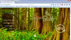
Screenshot of website with photo of a forestA business owner recently asked to see some examples of websites we’ve worked on so that they could get a feel for our ‘style’. It’s a great question and most companies that create sites for clients do have a distinct style.
At Out-Smarts though, it’s not about us it’s all about capturing our clients’ style (or brand!). We work hard during our discovery process to truly understand our client’s style and goals and to make sure that this shines through in the sites we build.

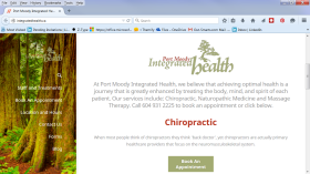
Screenshot of Port Moody Integrated Health website with photo of a forestHere’s an example from a site we launched recently. The client is Port Moody Integrated Health, a clinic that provides Naturopathy, Chiropractic and Massage Therapy services.

When we started working together they had a vision of a site that is uncluttered and easy for people to navigate on any device, one that contained exactly the information that their clients required and, most importantly, conveyed tranquility and natural balance (this is how people feel when they leave the clinic). The site also had to have a west coast feel.

Screenshot of Port Moody Integrated Health website with photo of a forestWe created a scrolling parallax site that is responsive to major devices. The background image on the main page is the rainforest of BC. Clients can easily click on the navigation to book and appointment, find forms or locate their clinic. It’s also integrated to their online booking app so that clients can easily schedule their appointments online.

Whether it’s websites, social media or search for us it’s not about our style, it’s about finding our client’s style and we work hard to make surer we do that.