
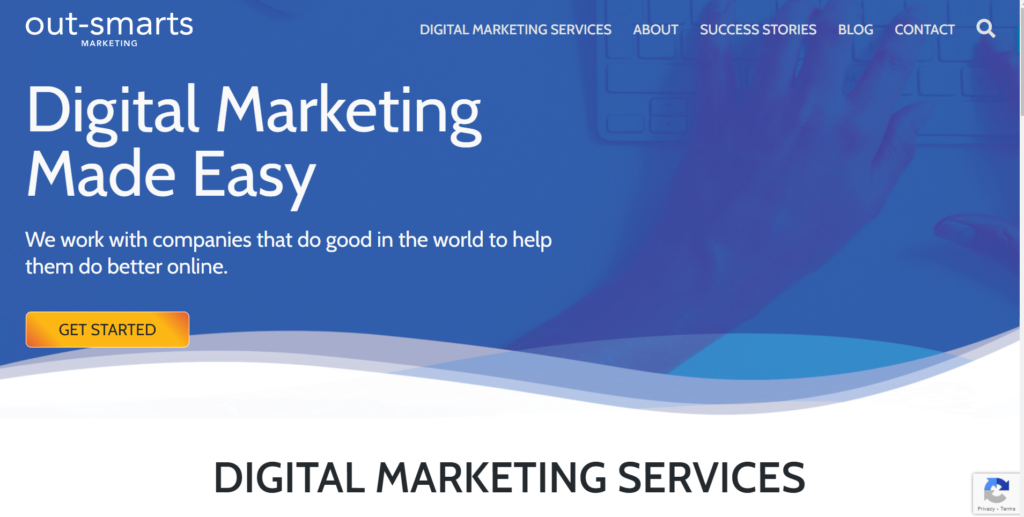
It’s our 19th birthday this month (this week in fact) and in honour of this momentous achievement, we’re launching our brand new website.
Launching a new website is always thrilling and exhilarating, made even more exciting when it is the culmination of months of hard work (and even longer in rumination and brainstorming).
It’s also anxiety inducing as you wonder if your visitors will like it, if it will be easy for them to navigate and if everything will work as it should. Because of this we always prefer to do a soft launch to make sure we have time to fix and minor errors before sharing it with the world. We’ve been fixing the site(read procrastinating) in readiness for this launch for a few weeks and now it is time to tell the world.
This is Out-Smarts fifth new website in our almost twenty years of existence and I have to say that it is the one I am the most proud of (but then I have said that about every one).
Thank You To The Team!
Big kudos goes to our team including Kostya, Anne, Grace, Catriona and Ashley for their dedication and commitment to the project and for their fantastic work, as well as to our extended partner network and fellow agency owners Rina and Pip for their feedback and encouragement.
Keep reading to see some of our past websites and to learn some little know facts about Out-Smarts.
The Reason We Needed a New Site
Everything starts with a reason right? In this case our reason for creating a new website was because we wanted one that better reflects the good work that we do, a site that would showcase our design and development capabilities as well as our success stories, one that would be unique and different to anything we had done before and that reflected our playful spirit combined with our love of doing the best work possible.
Like our first website and logo which was founded on an outlandish idea of crop-circles of all things, our current site was influenced by two things, firstly the cycles of nature (moon phases and tides) to reflect our commitment do doing good for the world, and secondly playful and fun to reflect our mission to make digital marketing easy and fun for our clients.
Website Design And Development Process
At Out-Smarts we are fanatical about providing the best standard of service we can possibly provide our clients whether on website projects, advertising, SEO or strategy (i.e everything we do). Internal projects have often taken a back seat to this though – our own website has from time to time been neglected as we worked to fulfil the commitments we’d made to our clients. It’s like the story of the shoe maker’s children who sometimes go without shoes. The moral of that story is that hard work can make your dreams come true so for this site we really buckled down to bring our vision into being .
Rather than building our site off the side of our desks (read on night times and weekends) taking shortcuts where possible like we’ve sometimes done in the past, for this new site we adopted the same process that we go through with clients. I am glad we did this as it gave us a really great perspective on things from the other side of the screen.
If you’ve never built a new site you may think it’s an easy thing to do, after it’s just some great looking visuals and text, whereas in fact, there is a lot more to it than that. There are many factors that go into building and launching a site and lots of different things you have to consider. Here’s the approach we took:
Step 1 – Website Discovery / Planning
Our website projects always start with an in depth discovery process but this site was different. It all started with a creative design concept that you can read about shortly. The discovery step is vital though and involves meeting with clients to discuss their goals for the new site, success criteria for the project.
In this step, we want to know as much about their business as possible from their history, mission and values to their branding, culture and vision. We dig deep to understand clients’ target audience and key stakeholders often interviewing them so that we fully understand their perspective and can take that into account in the design process. We research their company, their competitors and audit their current site to make sure that we’ve considered all factors (and so that we can retain as much SEO juice as possible). This typically culminates in a detailed scope of work for the project. For our new site we did all this and more.
We went through this same process and let me tell you we now know why it’s often difficult for our clients to see the wood from the trees and why it is important to look at things from all angles. It gave us a totally different perspective on our business and process, one that will help us improve this first step for our clients in future.
Step 2 – Website Design
Our design process builds on the discovery phase and is one of the most fun parts of the project because people typically respond better and have more fun with visuals.
When working with clients on this we look at sites they like and sites they don’t and start laying out concepts. The initial concept for the design of our own new site came about in a totally different way one I wouldn’t use with a client – it started with a water colour painting of the proposed design of all things. We then got serious and used a tool called Milanote to capture the design ideas for the new site, from site colours and fonts to concepts and navigation. It’s a tool we will definitely use again to share these with clients and keep track of ideas.
We laid out design concepts and wireframes in Powerpoint and Figma too in order to hone in on the ideal design before creating the final versions in Photoshop, incorporating all images and dummy text and then packaged up for our development.
Hand in hand with the visuals goes the information architecture. This is perhaps even more important than the look and feel of the site as it is is all about the pages on the site and how visitors will navigate them to guide them to the end goal. It’s like a roadmap of the site showing pages and user-flows. This one was pretty boring though and in greyscale (unlike the ones we do for clients that use their brand colours and fonts). An important part of redesigning a site architecture like this is SEO as it will guide you as to the content to include and the words to use in the URLs and more.
New Website Step 3 – SEO Optimized Content
SEO is often an afterthought in website design and this is a big mistake. Taking SEO into account helps you to understand our current traffic, and to craft your content around your visitors’ requirements. It helps you map your copy to what visitors are looking for and it helps you to maintain all that juicy traffic that your site has built over the years. It all starts with keyword research and builds from there. It’s important to include keywords in all the right places and to provide those to the writers.
Content is always the component that takes the most time and seems to be the most painful for our clients and let me tell you we can now commiserate having felt their pain.
The optimal length of a website’s content especially in an industry with lots of competition like ours is over 1000 words. Do you have any idea how long that takes? We don’t typically write content for our clients preferring to guide them or bring in our writing partners and provide keyword optimised SEO direction. We will certainly be more sympathetic to clients who feel the pain of this step in the process!
Step 4 – Website Development
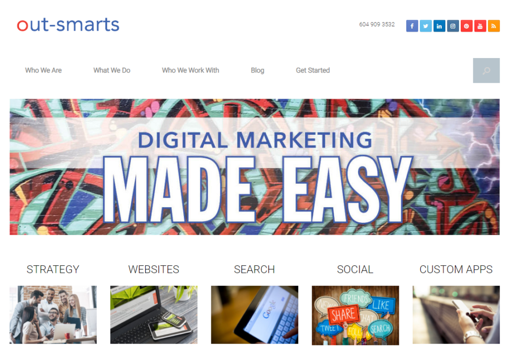
Our new website, like most of the sites we build, is custom built on the WordPress platform. Our last site, which was built in 2015 on a shoestring budget used a theme which we purchased. That was one of my biggest mistakes in business. It turned out to be slow and kludgy. Themes are also insecure and often it takes longer to figure out how the theme works than it does to build a site from scratch. As a result of that lesson, we made a rule to only build custom site for our clients and ourselves.
The new site, like all our sites, is built using a bootstrap framework which means that the site will work well on all devices.
Our moving wave is designed to showcase our capabilities on desktop and you will notice that it’s static on mobile so as not to distract from the overall message on a smaller screen.
Step 5 – Site Testing and Launch
For recovering perfectionists this is the hardest part! It is obviously important to test and make sure the site is fast, works well and looks good on all devices. At some point though you have to let go and put it out to the world. In going through this process again on our own site we’ve been able to identify ways to improve and track the launch process for our clients. Project management of future website projects will benefit greatly as a result.
As I said right at the start of this post, launching a site is exciting and anxiety inducing. Now that the site is out in there in the world I hope that people (you!) will love it and that it will have the desired affect of helping build business and positively impacting how our brand is perceived.
I would love to hear your feedback on how we can make it better and especially if you notice any links that don’t work or typos (email info@out-smarts.com).
When you launch a site, that is just the first version of it. Websites are organic and should be added to and made better over their lifetime. They should get better over time.
Web design is constantly changing and evolving as technology gets better and fashions change. Take a step back in time and see our websites from the past 19 years.
Out-Smarts Websites Through the Years
Thanks to the Internet Archive we can take a trip back in time to show you how our websites have evolved over the years.
Our first website was launched in 2002. As a budding entrepreneur on a small budget (i.e. no budget) it was designed in-house (the first website I designed), and developed on the brand new WordPress platform by Christine Rondeau who was just finishing her WordPress development course at BCIT and was looking for a willing guinea pigs to test out her new found talents on. It was the start of a beautiful relationship and we went on to build many websites together over the years forging a great friendship at the same time.
Interesting fact – our logo at that time was based on a crop circle adapted to look like a target.
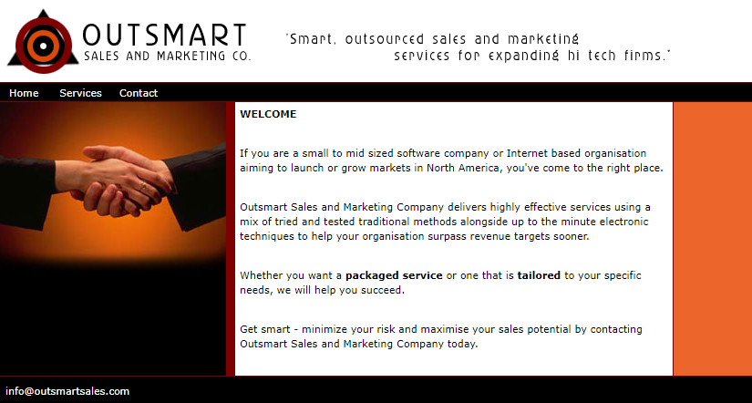
Outsmart Sales and Marketing Website 2002
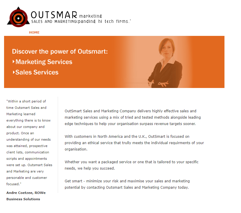
Outsmart Sales and Marketing Website 2008
We used the same basic custom WordPress site theme and layout for several years, adapting, enhancing and improving it as we grew.
Interesting fact – Out-Smarts started out providing traditional sales and marketing services aimed at tech firms.
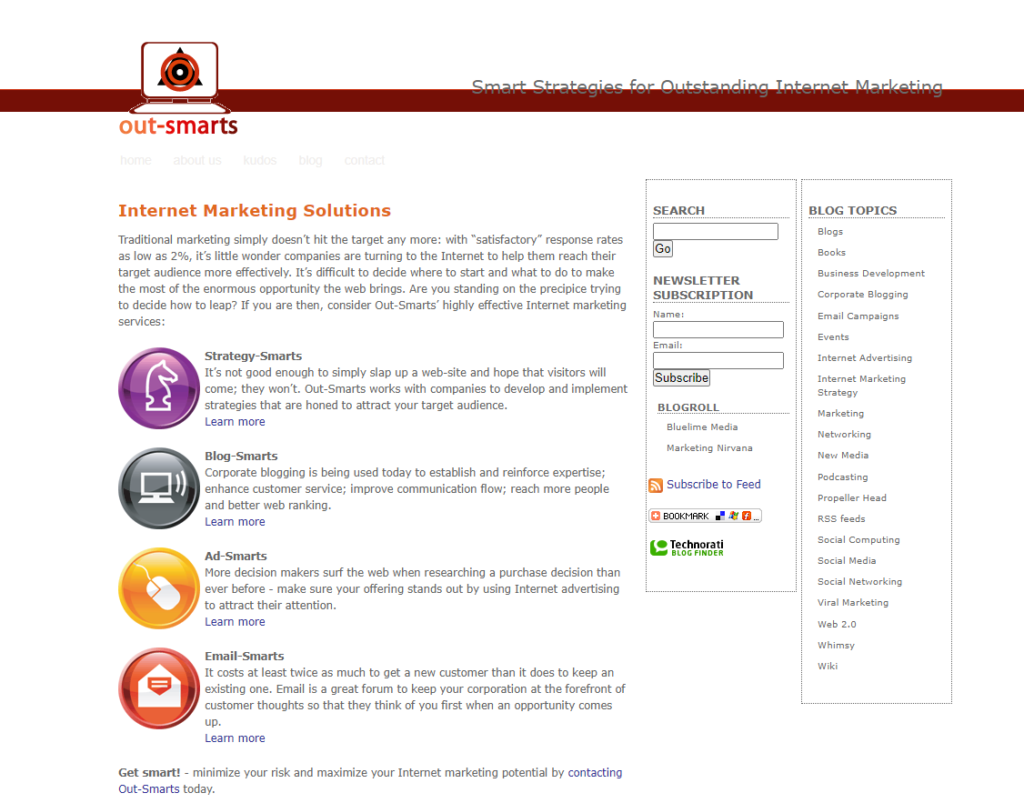
Out-Smarts – Internet Marketing Solutions – 2007
In 2007 we took the big (and risky at that time!) step of deciding to focus solely on internet marketing. We did a bit of a rebrand to incorporate a laptop into our logo, and launched our blog which to date has published over 700 articles. Services focused on strategy, blogging, ads and email, adding social media to the mix in 2008. Everyone thought we were off our heads at the time telling me that no one would ever use these platforms extensively for business!
Interesting fact – our tag like at that time was Smart Strategies for Internet Marketing.
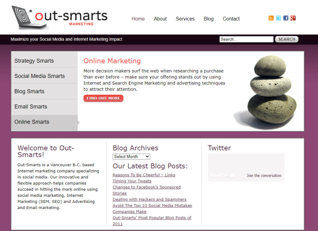
Out-Smarts Marketing Inc – 2012 – 2015
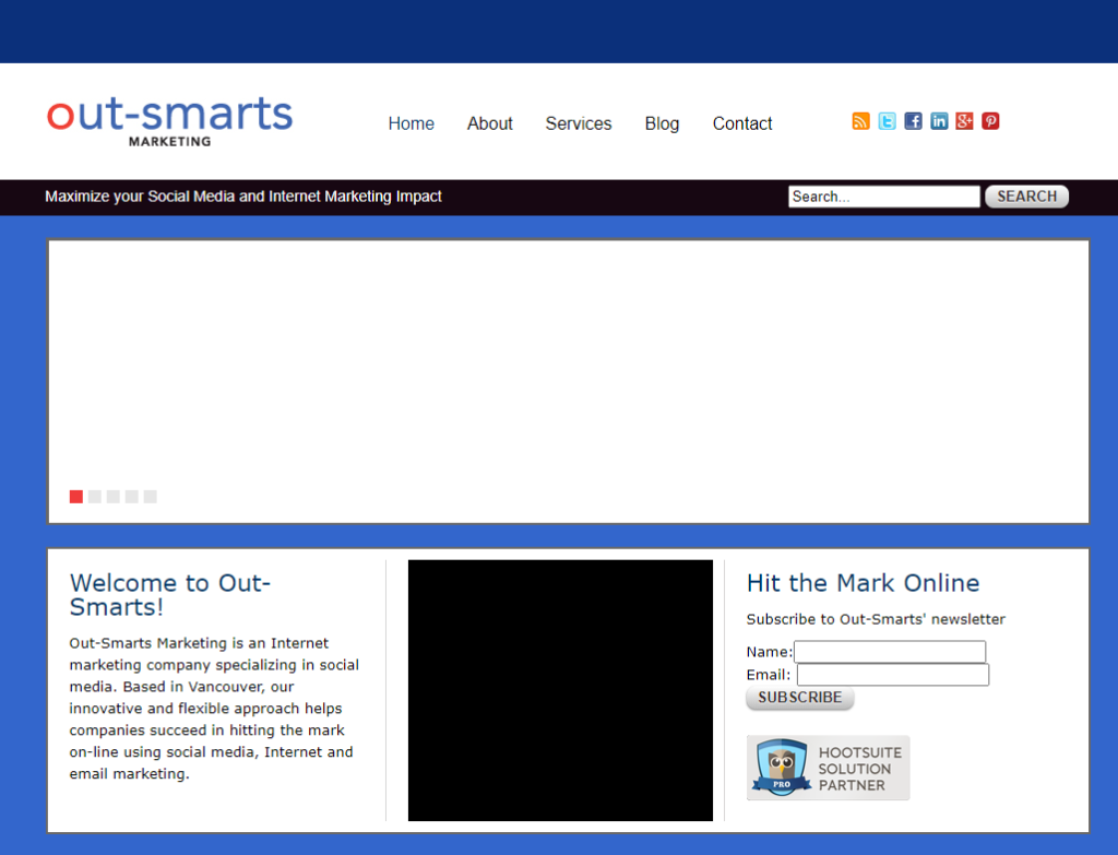
We incorporated the business in 2009 but didn’t get around to updating the site until 2012. Like all of our sites, this was designed and developed in house. This site was launched over 9 years ago and it’s funny to see how dated it looks. Our tagline then was ‘Maximise your Social Media and Internet Marketing Impact’. Look how zen we were. We also had a blue version of the site that you can see below. The slider in the image from the archive doesn’t render – sliders should remain a thing of the past anyway!
Out-Smarts Website 2016
This was the theme based site mentioned earlier. We wanted to quickly launch a site that was mobile first and responsive working on smartphones which were by then ubiquitous. It worked although in retrospect using a theme was not the best way to go.
Interesting fact – the graffiti background used in the slider image was taken from street art from an alley in Gastown in Vancouver near our old office.
Key Takeaways As We Launch This New Website
What a journey this has been from water colour paintings in 2019 to waves and oceans to procrastinating over launching in the midst of a pandemic. The key takeways in all this for me are that it is important to follow tried and tested processes even on your own site process because that helps you to launch a better site, and leads to insights that will improve both the business and the processes for my clients. To take time to do it right from website discovery to design and launch, not cutting corners. That and not procrastinating too long about sharing it with the world. I almost didn’t write this post which would have meant a rather puny post on social media with no fanfare. It is important to celebrate and to reflect on all the hard work and commitment and to once again thank all the great people who contributed to making it so.
Mhairi