Digital accessibility means making a website, digital app, or online document accessible to people of all levels of ability. It is an essential part of good website design and user experience that is often overlooked. In some parts of the world like here in Canada, it is required by law.
The term “digital accessibility” isn’t limited to achieving good user interaction for people with disabilities. It also means ensuring that your website is accessible when users experience temporary impairments as well. Creating a website that can easily be navigated by users recovering from surgery or a broken arm is one example. External impairments also fall under this category – for instance, ensuring your website loads quickly when the internet connection is limited, or managing the contrast of your website if it’s being viewed in a brightly lit room.
The number of users who access the digital world is increasing at a rapid-fast rate globally. Online resources from shopping, to information and data, are now in greater demand and this is being compounded since the pandemic because everyone has been working from home or stuck at home with nothing to do.
While it’s vital to shift business practices online, it’s even more important to prioritize content accessibility, not only is it simply the right thing to do, but it can also play a big part in capturing a new and large audience.
Making your website more accessible also has some big SEO benefits too, as Google and other platforms continue to place more emphasis on the importance of accessibility.
How Can Digital Accessibility Benefit Your Business

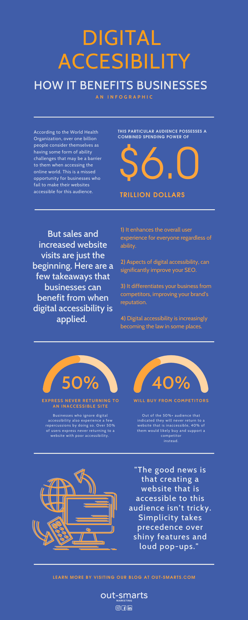
According to the World Health Organization, over one billion people consider themselves as having some form of ability challenges that may be a barrier to them when accessing the online world. This is a missed opportunity for businesses who fail to make their websites accessible for this audience, as they have a combined spending power of nearly 6 trillion dollars.
Businesses who ignore digital accessibility also experience a few repercussions by doing so. Over 50% of users express never returning to a website with poor accessibility. Out of this number, 40% are likely to buy from a competitor instead.
But sales and increased website visits are just the beginning. Here are a few takeaways that businesses can benefit from when digital accessibility is applied.
- It enhances the overall experience for everyone regardless of ability.
- Aspects of digital accessibility can significantly improve your SEO.
- It differentiates your business from competitors, improving your brand’s reputation.
- Digital accessibility is increasingly becoming the law in some places.
- It’s also now a ranking factor in Google’s search engine algorithm.
The good news is that creating a website that is accessible to this audience isn’t tricky. Simplicity takes precedence over shiny features and loud pop-ups. Here are seven tactics you can use to increase digital accessibility to your website.
Digital Accessibility Best Practices and Guidelines
Increase Content Accessibility with the Use of Alt-Text
Alt-Text (also known as alternative text) is information included in your site’s HTML code. It is used to describe the appearance and function of a particular image on a page.
Using Alt-Text is beneficial for a variety of reasons. From a user experience standpoint, these are useful if your website is unable to load a file so that people can still ascertain what the image is supposed to be.
We mentioned previously that Alt-Text could also improve your SEO. Search engine crawlers cannot “read” or scan visual content on your site and rely solely on the code. Including Alt-Text into your photos can provide better image descriptions for these crawlers, which allows them to index these images appropriately, which in turn helps your images show up in image searches too.
But how does it increase your site’s digital accessibility?
Alt-Text is essential and useful to visually impaired users who have difficulty seeing the web content of the page. Just like search engine crawlers, users who browse through sites using screen readers (software that helps people with sight loss) can better understand the content of an image when Alt-Text is used.
(We incorporate Alt-Text into all of our SEO strategies, so feel free to reach out to our team to learn more).
Be Strategic with your Colour Usage
Strategic colour usage is crucial to adequately conveying your visual brand. It’s also vital for digital accessibility, especially when selecting contrasting colours for your website.
Colours that offer maximum contrast between the background, copy, and other decorative elements can enhance legibility for users with low vision or colour blindness. Using red or green should be avoided (especially on black) as these colours are most common in colour blindness. It is best not to use bright-coloured text on bright-coloured backgrounds, and intensely patterned or texture backgrounds are a no-no too.
So, what should developers and designers do when it comes to best practices?
The World Website Consortium recommends a minimum contrast ratio of at least 4.5 to 1 when selecting colours for text and the background.
Keep your Layout Linear
Creating a simple, straightforward and linear page layout benefits all users. When building your website, the content should ideally follow a linear and logical layout so that it is easier for users to navigate and find what they are looking for.
Avoid creating a cluttered and complicated site where users need to dig and download to get the information they need. Aside from this being an essential best practice in UX and design, it also makes things accessible to users on the Autism Spectrum.
The way you lay out text is meaningful too. Increase accessibility for users with dyslexia by maintaining consistent alignment to your copy. Ideally, your text should be flushed left.
Make Buttons & Headings Descriptive
Descriptive elements include buttons or different call-to-actions that encourage users to dive deeper into your site. These are useful elements to increase your conversions and click-through rate.
It may be tempting to create some allure by using colourful idioms, but doing so can hinder your website’s accessibility so using common language is best if you want your content to be understood. This is especially true if users are visually impaired and use screen readers to navigate websites.
Build and structure your content using proper markup and make sure that buttons and headings are descriptive in context. Screen readers will have better clarity on how to navigate your site when the copy is straightforward.
Using descriptive elements also creates predictability and clarity, which can significantly assist users on the Autism Spectrum.
Incorporate White Space & Proximity
Whitespace is your friend. It can be described as the space between all elements on your website. The distance between your website sections, text and images is considered whitespace.
When it comes to practical design, less is more! Not only does whitespace create the look of a clean and modern website, but it allows the eyes to thoroughly scan, take in and “rest” when reading your site. It ultimately reduces clutter, making all elements of your website easier to understand.
While making good use of white space is convenient for visually impaired users, it is beneficial to all website visitors.
Build with Different Devices in Mind
Building a site that is mobile responsive (i.e. works on all devices) is one example of mindful design. It’s also important to note that mobile devices are just some of the many appliances that individuals with disabilities use.
It’s essential to determine how user functionality can differ between devices with different input modalities. These include tablets that are touch-enabled with pressure sensors or devices that are hyper-sensitive to light settings.
Luckily, many of the tactics mentioned in this blog post can easily be applied when building websites to suit these devices.
Utilise Closed-Captioning in your Media
If videos are a big part of your website or content strategy, your media content must also be accessible! Incorporate closed captioning so that individuals who are deaf or hard of hearing can experience the content. Closed-captioning is also beneficial as it helps users focus and retain information quickly, while also allowing them to enjoy your content in sound-sensitive environments.
Last Thoughts About Digital Accessibility
One of the best things about increasing digital accessibility is that most of these tactics can be applied without a complete website overhaul.
Find out how you can make your website compliant with Canada’s accessibility standards!
As a company that works with non-profit organizations and companies that specialise in accessibility, we have the insights and knowledge to incorporate some of these practices into your website. Working with a recent client, we designed, developed, and launched their website with our insights and guidance on digital accessibility. Keep your eyes peeled on our blog to learn more about that particular case study!


